Turning Plain QR Codes into Professional Sales Tools
Transform Turbo Referrals' basic QR code into a customizable feature that supports diverse professional use cases. Accessible seamlessly across desktop and mobile.
Designed For
Turbo Referrals
My Role
Product Designer
Platform
Web App
Timeline
2 Weeks
About Turbo Referrals
Turbo Referrals is a SaaS web app for salespeople in automotive industry. Each user has a unique link to share to generate referral sales. This share mechanic is the core of the product.
Problem: Low Adoption & Missed Opportunities

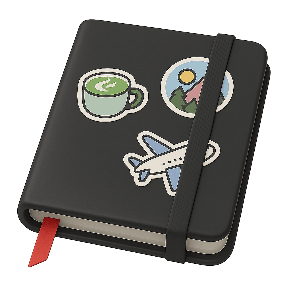
At launch, we only offered a plain QR code and URL to share. Many salespeople didn’t know how to turn QR code into professional, on-brand assets for email, print, or social media. Feedback like “I don’t know what to do with this” signaled low adoption and missed opportunities.
Solution: Introduce QR Code Customization Feature
I designed a QR code customization feature to bridge this gap, allowing users to create marketing assets with QR codes directly in the platform without relying on external tools.


Responsibility & Deliverable: I led product design end-to-end
I started with vague draft of project scope, led the design process while collaborating with the PM, VP of Product, engineers and sales. I refined the scope through iterations and delivered:
Five ready-made templates
Customization flow (responsive across desktop and mobile)
Support materials (help center articles, email guides)
Impact: From Confusion to Adoption
+40% relative increase in clicks to the QR feature vs other sales tools in Turbo Referrals over a 2‑month window, based on internal page click counts.
Users shared positive feedback, saying customized QR code made sharing referral link easier across sales channels and it actually expand their referral pool more easily. One user said, "Now I put this everywhere! my email, marketing assets, and social media."
Process: Snapshot of My Design Journey
The design process was not linear at all, going back and forth many times, iterated on designs. In this case study article, I’ll be focusing on the challenges, primary design factors, and particularly the QR code screen design iterations that best show my rationale.
Key Challenges
Vague Scope
I started with an incomplete feature scope. It was difficult to see what steps were ahead, so I figured things out as I went. I actively communicated with the team to share my thinking, gather insights, and keep the work moving forward with a clearer, expanded vision.
Design under technical debt
Our team carried significant technical debt due to misalignment between the design system in Figma and the coded components. Ironically, using the “design system” didn’t guarantee implementation, and we spent a lot of time on UI QA after each release. I paid extra attention here and collaborated closely with the UI Engineer throughout to ensure feasibility and prevent avoidable QA issues.
3 Primary Design Factors
These three design factors were my north star when the path was unclear. They kept me focused and helped me deliver the right outcome even when I couldn’t see the full process ahead.
Users should understand the feature easily
I aimed for low learning effort, especially around permission details, so people could grasp how the feature works at a glance. I always questioned myself, “How users think/ feel when they first land on this page?”
Consider future scalability
Designed for growth, including new QR code types and potential availability outside the portal.
Ensure it’s practical to implement
Worked within technical constraints and engineering tradeoffs, balancing strong UX with feasibility to make the best decisions for both users and the team.
Iterations: Evolving Role-Based Control

First Iteration: One Personal Template
Supports a single personal template per user. After team discussion, we realized this could weaken dealership brand consistency because there was no unified pattern across the team.

Second Iteration: One Team Template
I explored a team-wide template controlled by users with Admin permission. This guaranteed consistency but removed flexibility for individual team member user.
Third Iteration: Multiple Templates for Team and Individuals
I combined both approaches: Admins can set team-wide templates, while individual team members can create their own. This struck the right balance between consistency and autonomy.
3 Design Decisions with Rationale

Row-based layout
I separated team and individual templates into rows (top = Team, bottom = My Templates). This repeated structure with small differences reduces the learning curve for understanding template types.

Permission-based buttons
Users see the same screen regardless of permission level, but the button state differs. Creating a team template requires admin permission, so when a user lacks admin rights, the “+ Template” button in the Team section is disabled with a tooltip explaining why.

Carousel navigation
I chose carousels instead of horizontal scrolling after reviewing fragility risks with the UI Engineer. A partial flex-based horizontal scroll had caused layout issues in prior releases; the carousel is simpler and more stable across breakpoints and signals affordance better on desktop.
Reflection: What I learned and how I’d do it differently next time
This project showed me how agile iterations can turn vague scopes into clear, scalable designs. I learned to align stakeholders quickly, make smart engineering tradeoffs, and keep users at the center by defining clear design factors.
I also saw the value of pairing with engineers early, which helped reduce QA churn — this feature had ~60% fewer UI QA tickets compared to prior releases.
If I could do it again without resource constraint, I’d bring in direct user input through interviews and usability testing to validate success metrics faster and with more confidence.